Design System
I led the creation of a new design system that improved accessibility, enhanced our content, ensured consistency in our products, and made them easier to use. Through careful planning and collaboration with the team, we successfully built a robust design system that not only addressed our previous limitations but also provided a solid foundation for future scalability and growth.
Role
Design Lead
OVERVIEW
As our company prepared to transfer to a new platform we planned to redesign our design system to solve the issues we currently had. We had limited ability to customize our design system and had difficulty synching within the team as the team size grew. It was the right time to revisit our design system and improve it to enhance efficiency. We needed to establish a design foundation that would define our identity across all products and marketing collateral. This was a critical step in the process, as it would ensure that our products and brand were consistent and recognizable to our users.
PROBLEM
Inconsistency
Maintaining consistency across products was one of the significant issues. Without our own design system, it was challenging to keep track of all designs and ensure consistency across products.
Limitations
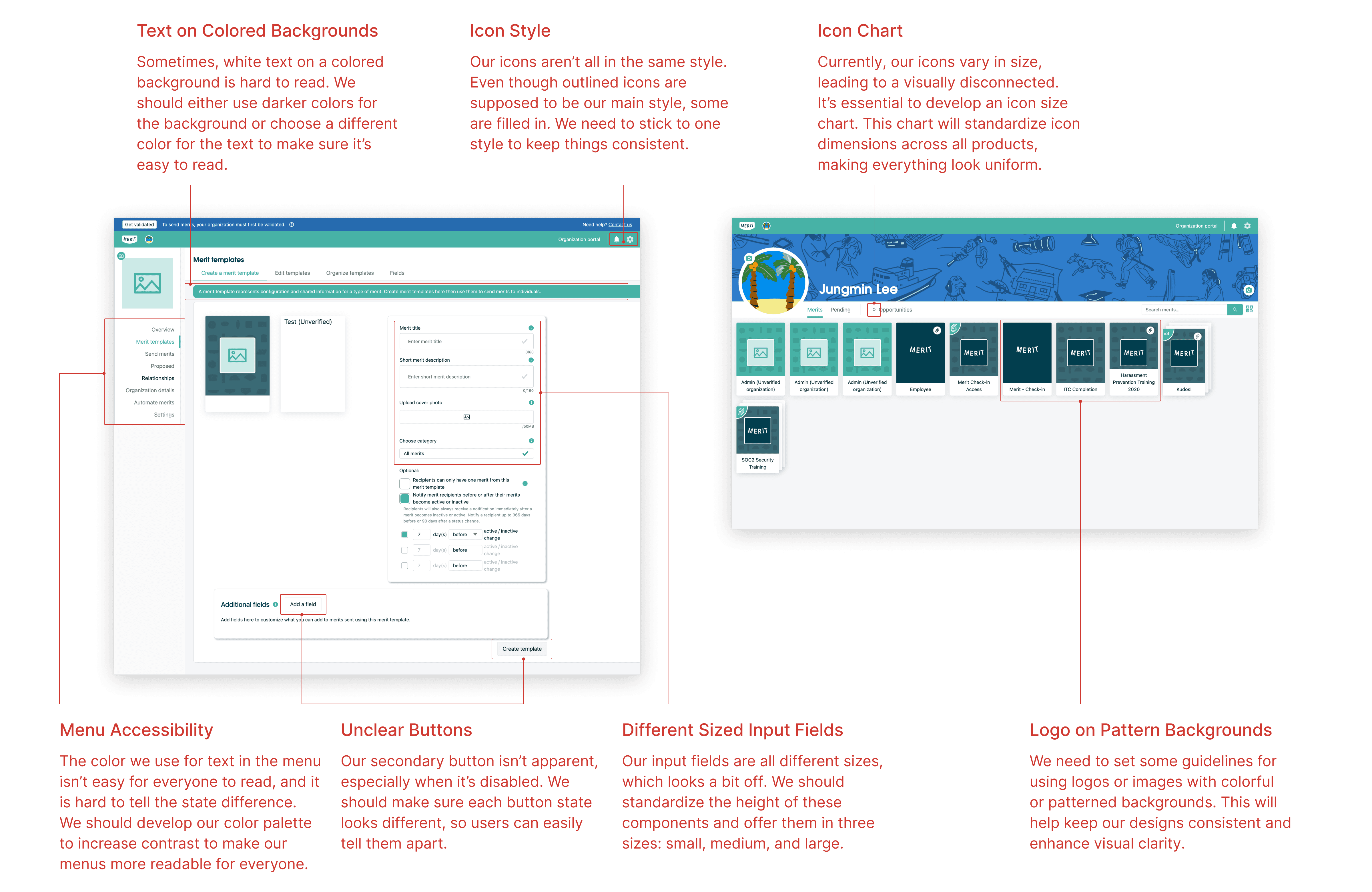
The previous design system was difficult to customize for individual components, and the old components were not tailored to our own products, nor did they utilize modern UI styles.
Time-consuming
Whenever a new design system is added, it take a lot of time. Especially if we need a fast turnaround process, we spend more time creating the components.
GOAL
Consistency
A design system serves as the source for all designs, from product design spec creations to marketing collateral. Once designs are consistent and structured, they are easy to manage across product specs and deliverables.
Efficiency
As we own our design system, we can easily evolve and customize it. This helps to create a spec efficiently, and we can reuse components with standardized guidelines.
Time-saving
With theming on the design system, designers can reuse components on every project, and engineering doesn't need to change them one by one whenever there are new components.
PROCESS
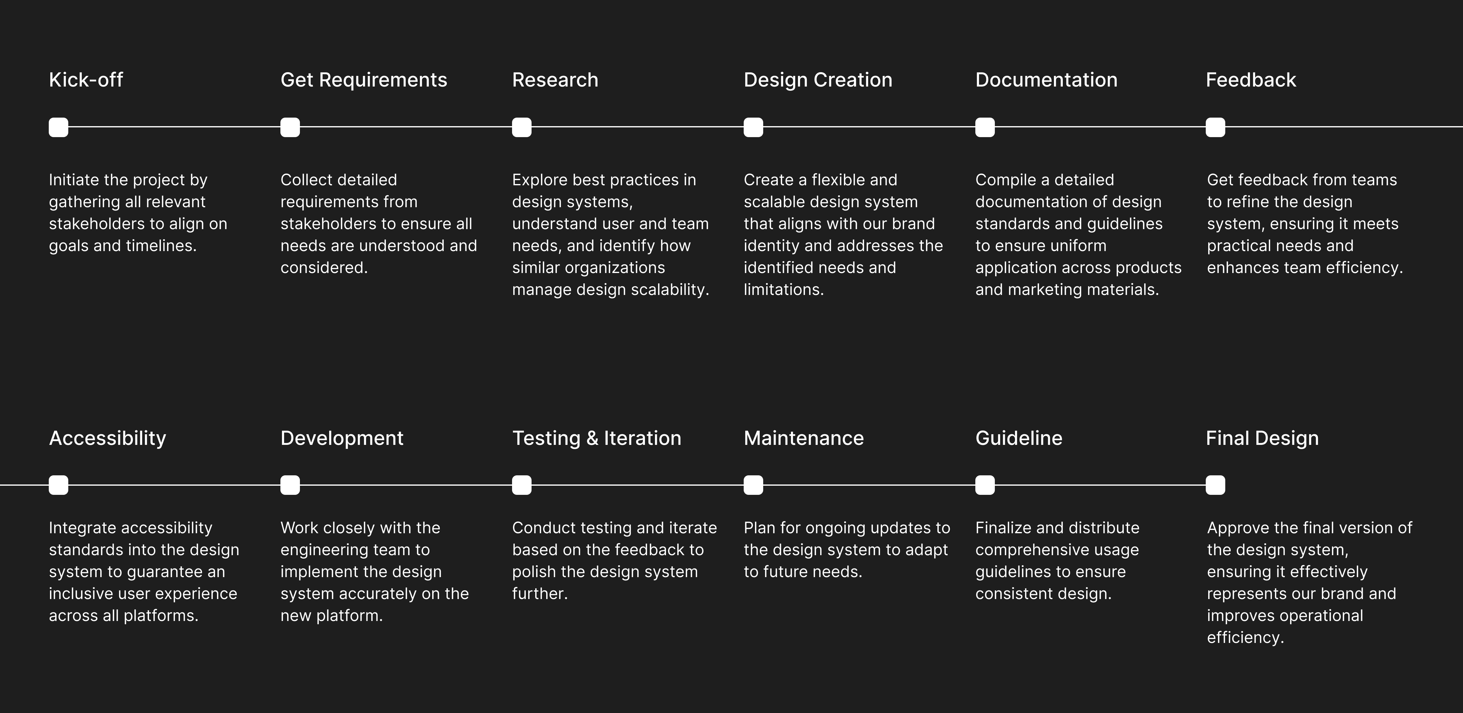
We reviewed the current components during our project kick-off discussion and identified improvement areas. After analyzing the current components, we confirmed which components were necessary and planned the entire project plan with all team members.
RESEARCH
I mainly focused on gaining knowledge about how the component system works, how engineers build them, and how each component works with others. I also found some great examples and inspiration to develop the UI. I gained more insights about the components by studying and analyzing improvement areas on the current component structures.
REQUIREMENTS
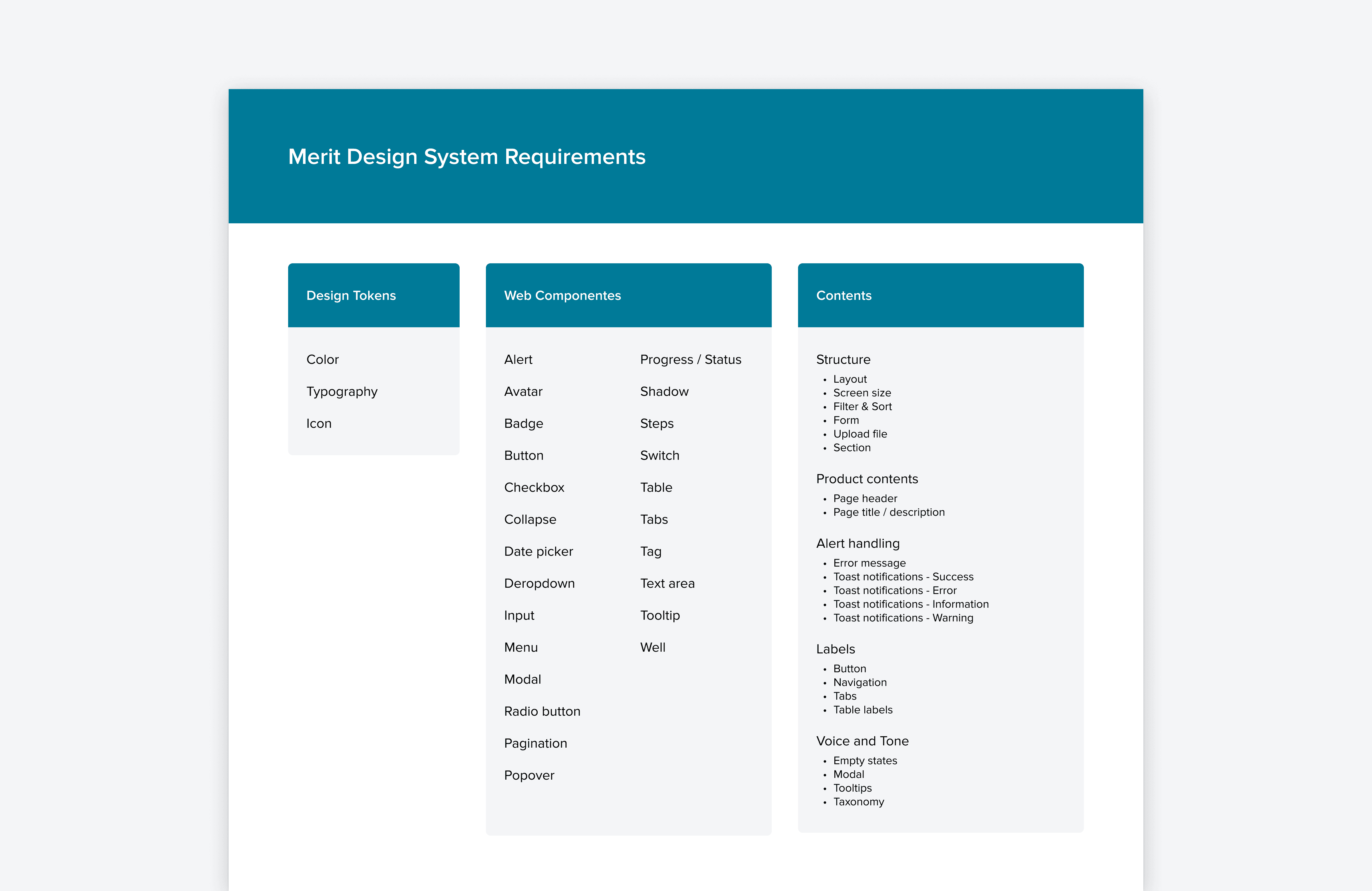
I listed out the UI components, patterns, and elements that our product uses or will need in the future. I also thought about the states such as hover, select, disabled, error, etc.
DESIGN DECISION
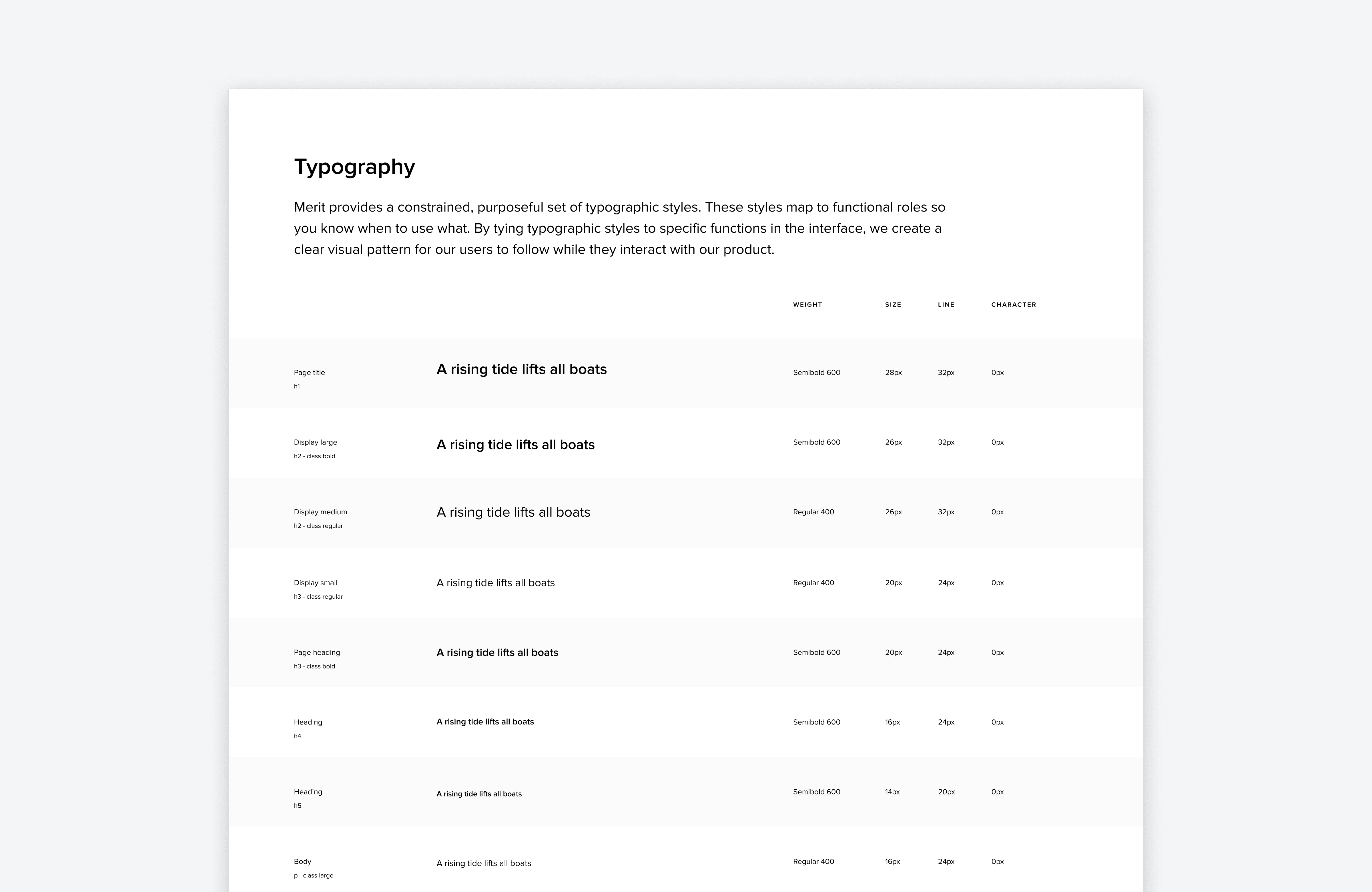
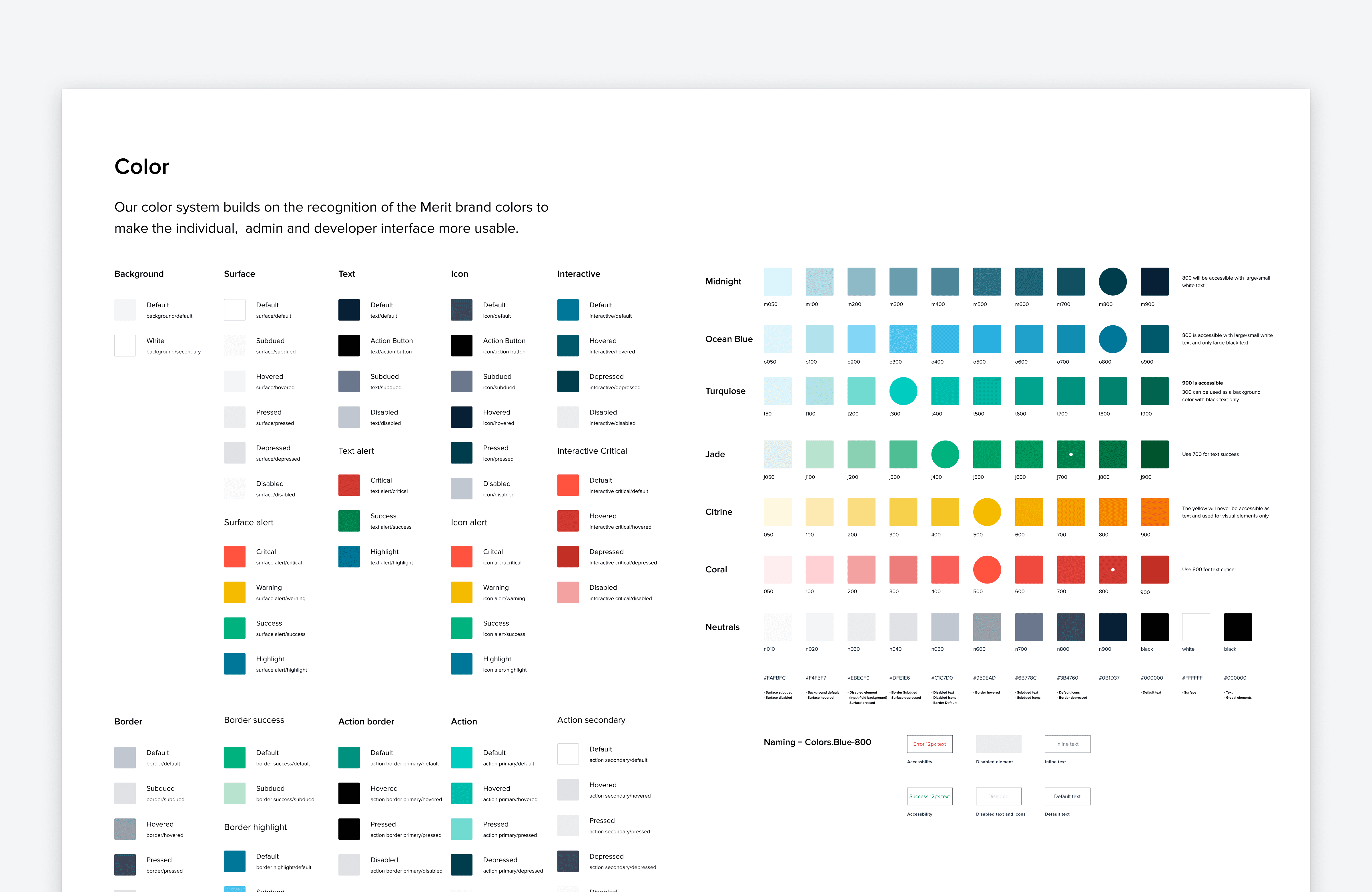
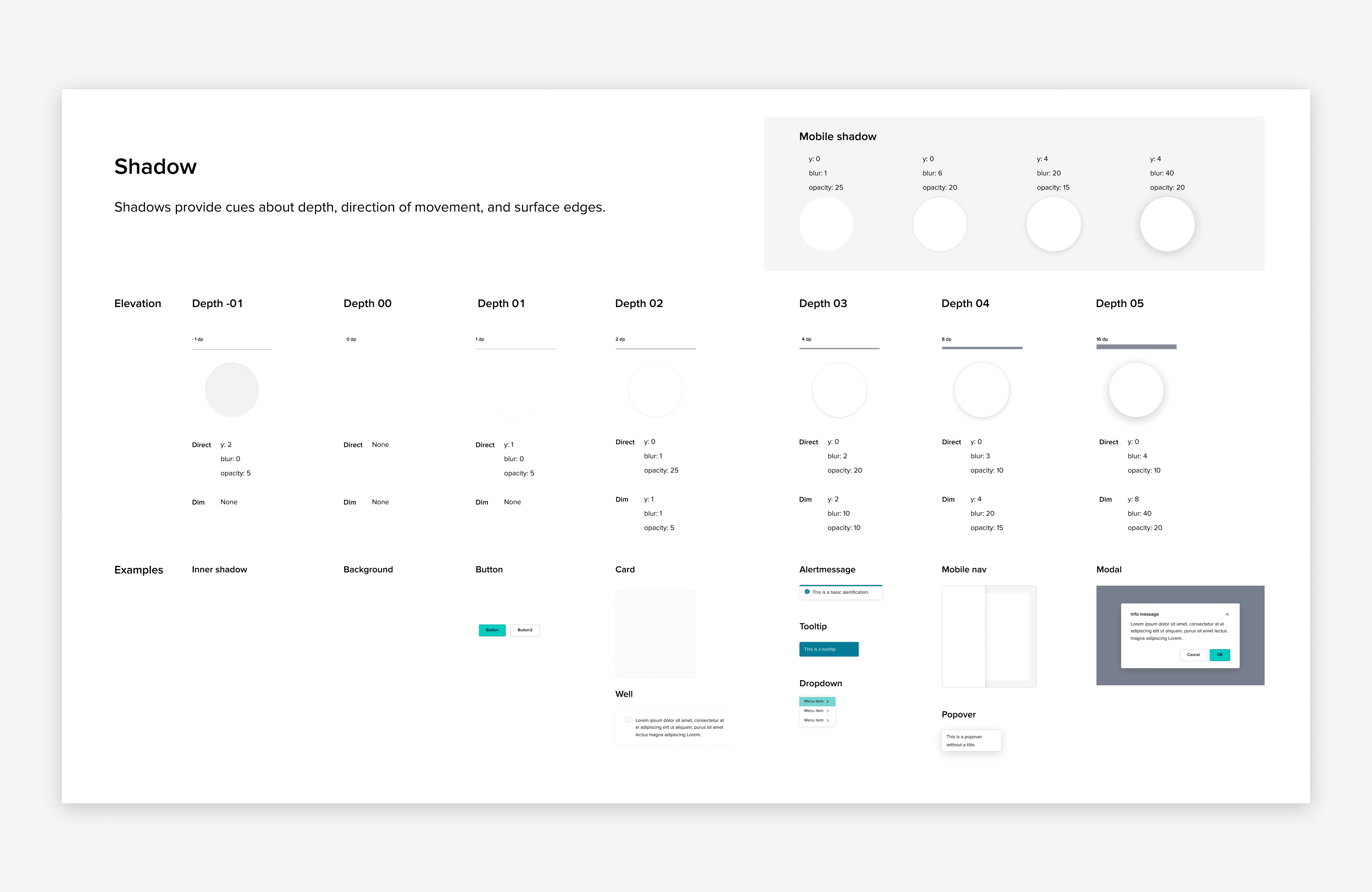
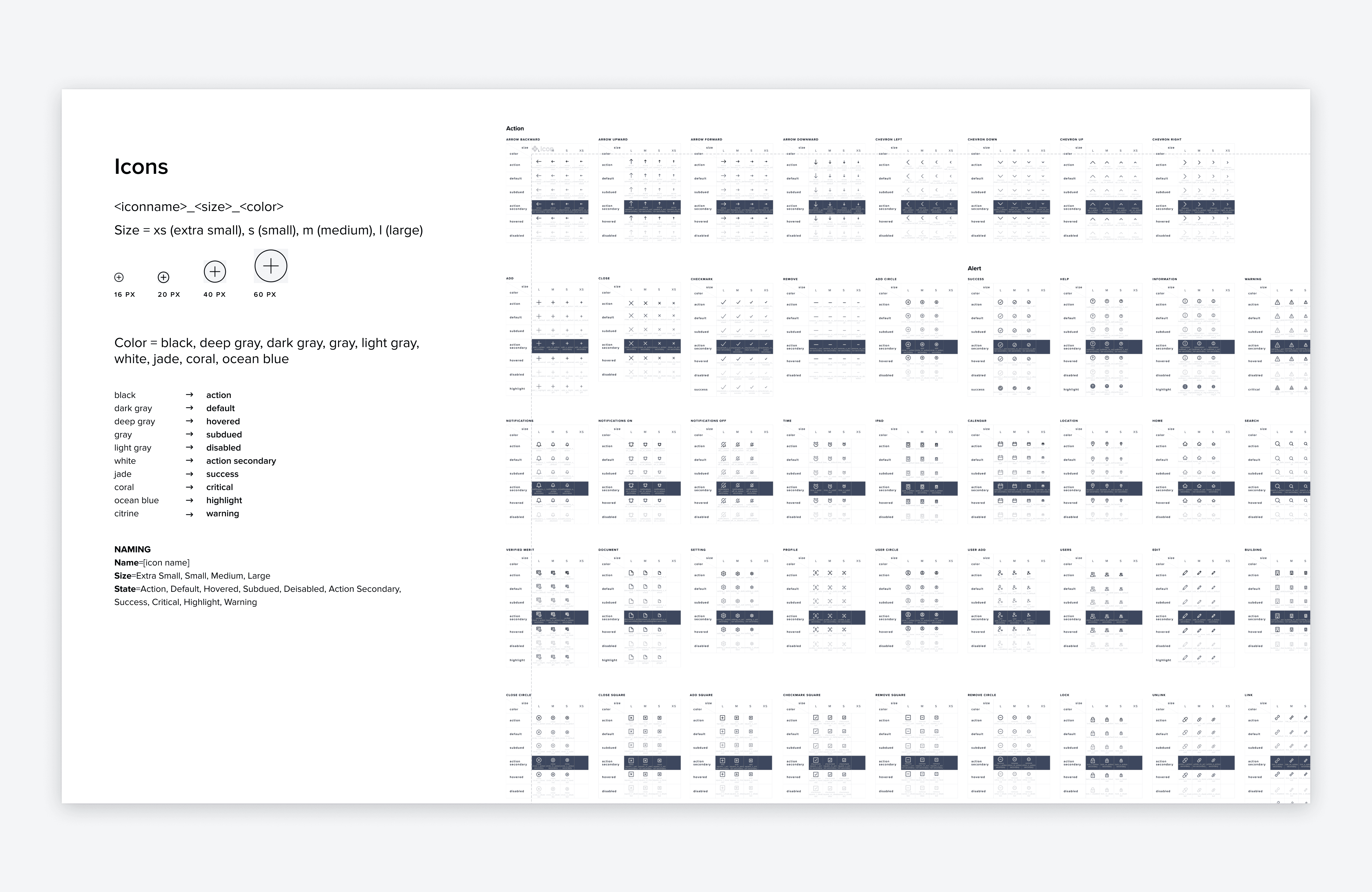
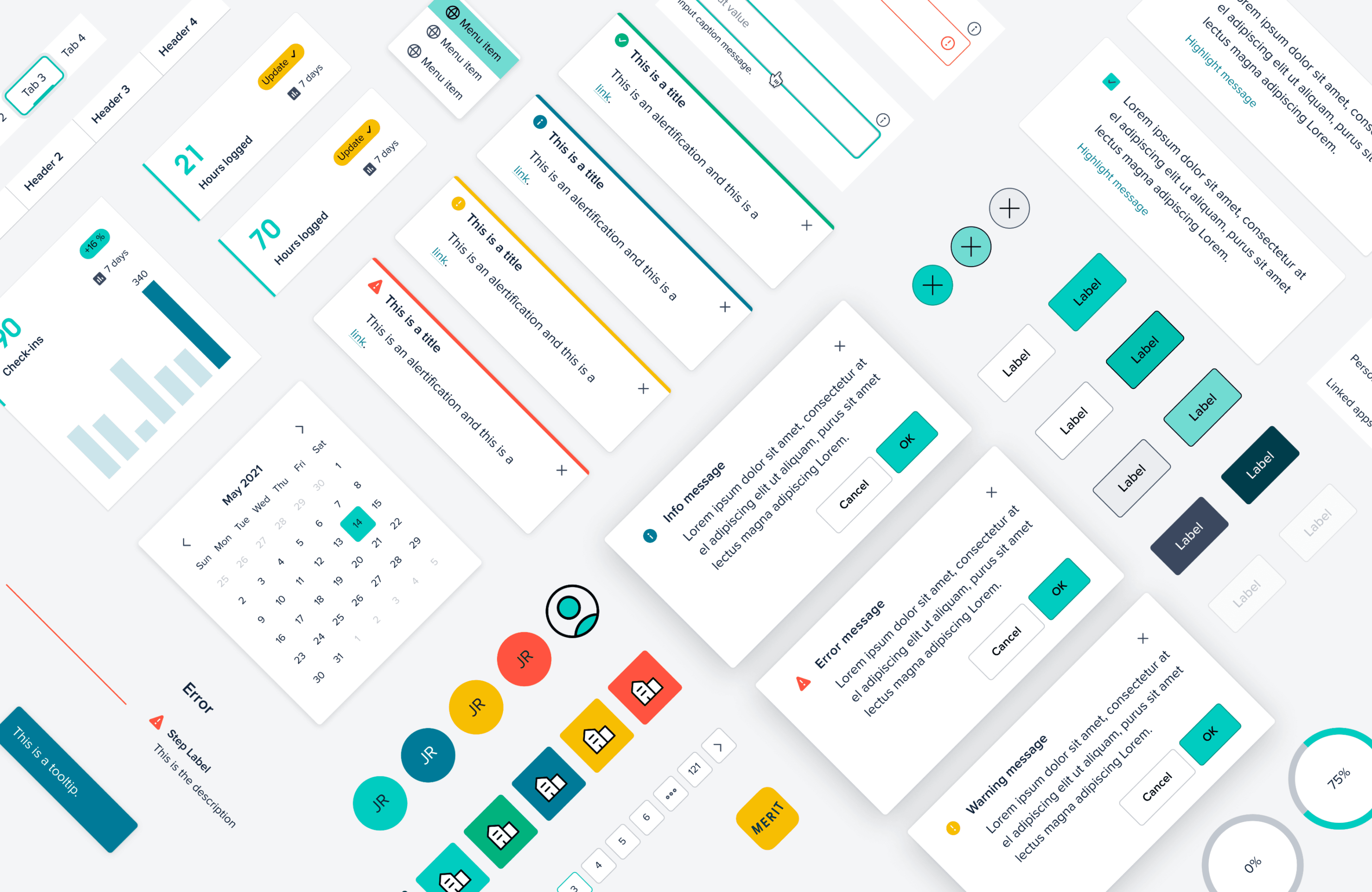
I started with design tokens and styling, including color contrast, typography, icon style, and an essential pack to maintain consistency. I named tokens to align with the implemented components instead of hard-coding the same name everywhere.
DOCUMENTATION
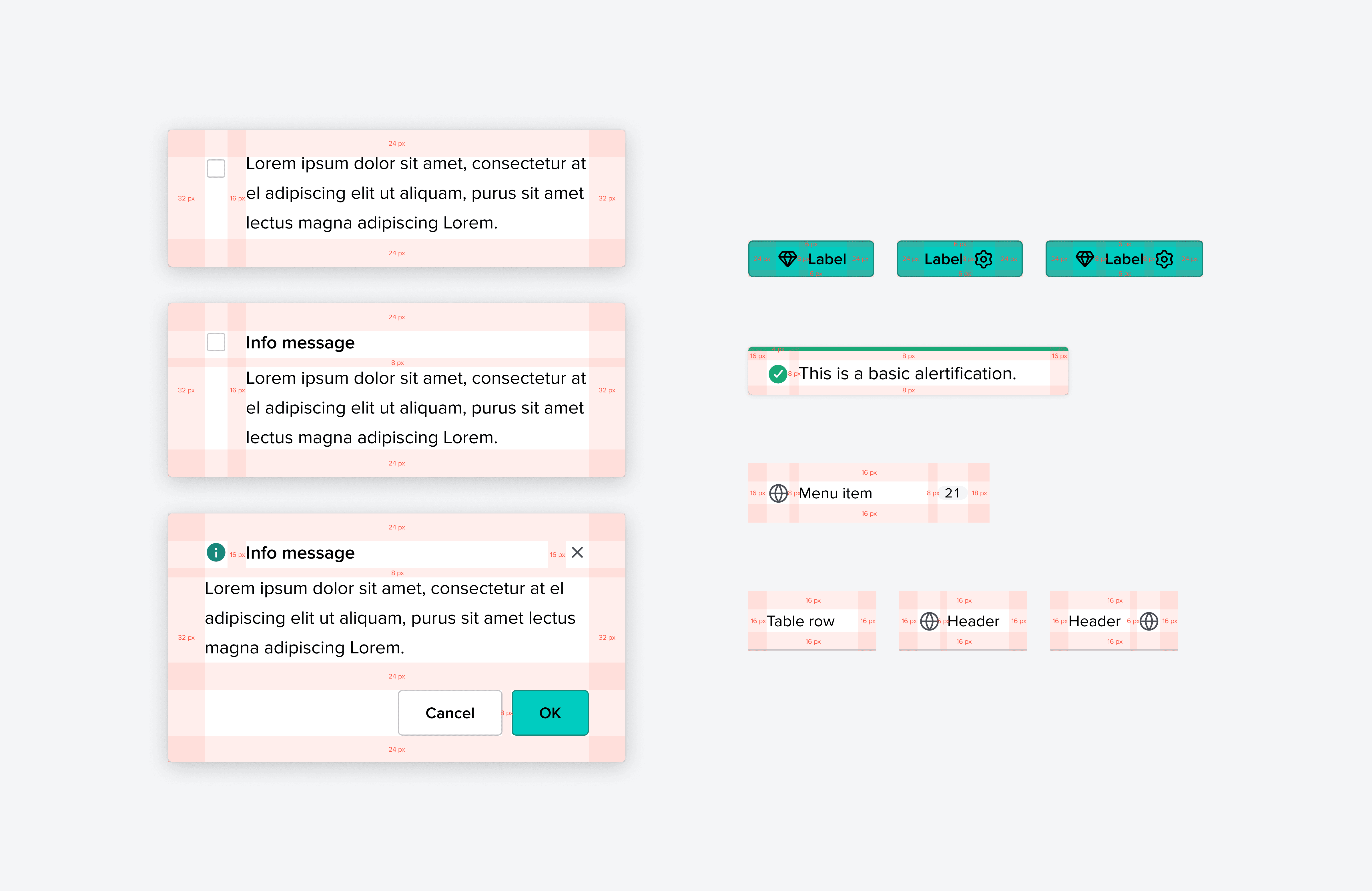
I kept documenting details in one place, which helped build structures and patterns when I handed off the design. I added all the details like spacing, color code, naming convention, and all layer names in the Figma design file for better communication.
ACCESSIBILITY
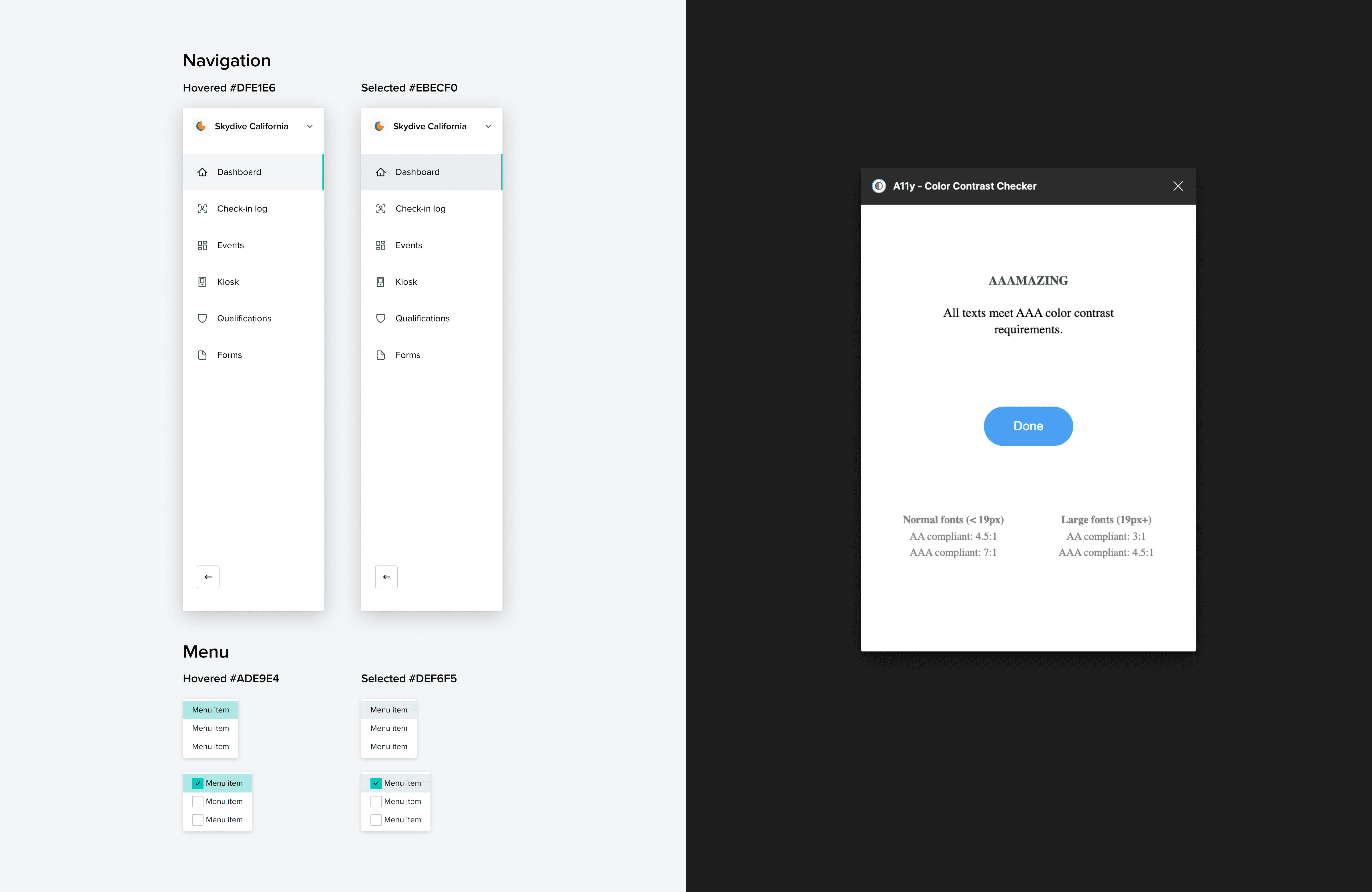
Testing the accessibility of designs is an important step. I carefully reviewed and ensured that each element met high accessibility standards. Additionally, I conducted tests to guarantee their effectiveness in an actual design after applying the components to the UI.
IMPLEMENTATION
During the implementation process, we faced a back-to-back situation where we needed to update every product after using the new design system. For instance, when we picked a light color for the selected row but realized it didn't work on the table, we convinced ourselves that it worked with other state colors. However, when we implemented it on the real table design and saw the transitions, it appeared strongly and disturbed the content when it was multi-selected.
TESTING AND ITERATION
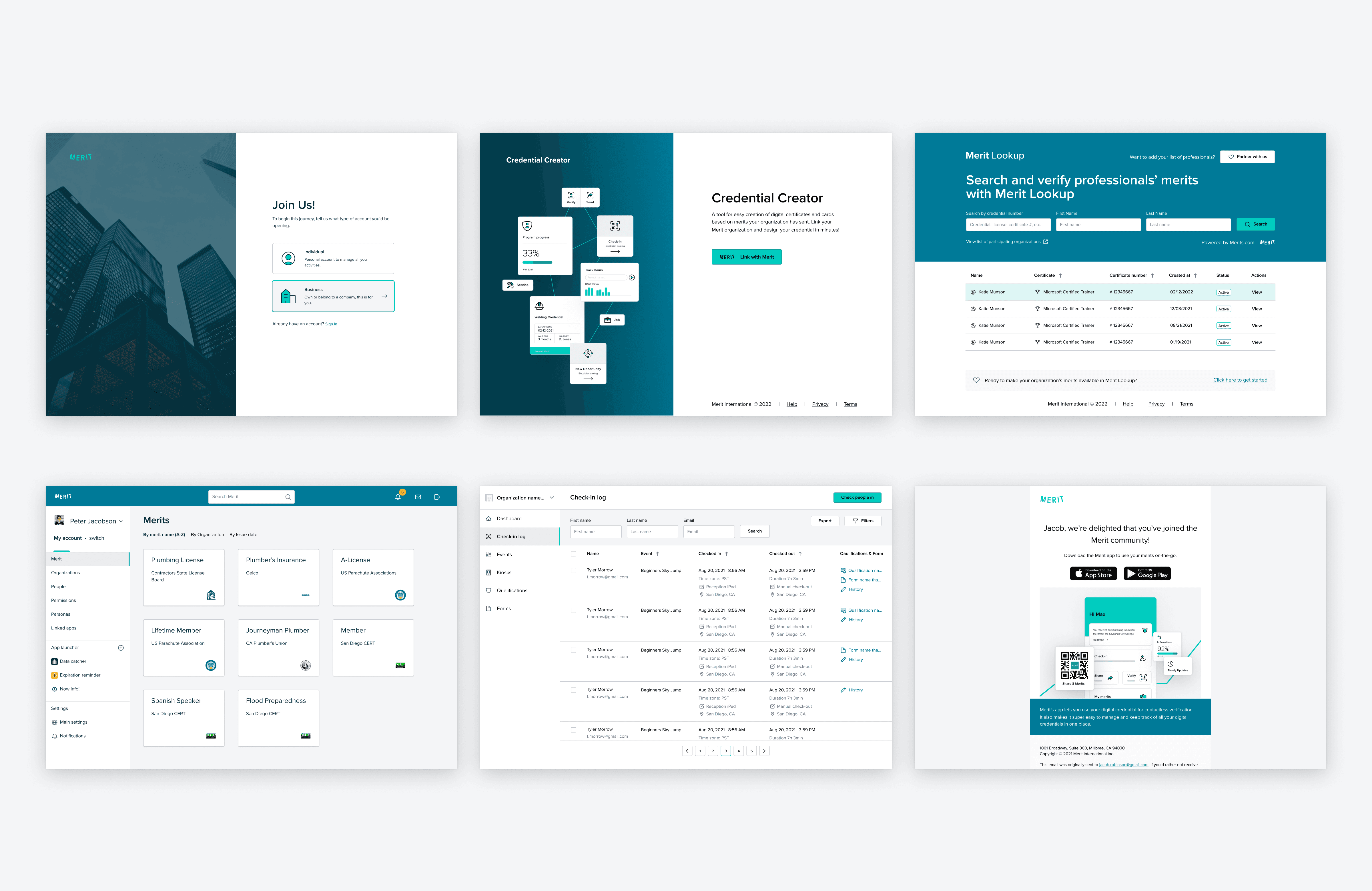
While the PRD was being developed, I applied the new design system to the new product. Since the product only had a concept and structure at this point, it was a great opportunity to test the effectiveness of the design system. Additionally, I created a UX audit chart to ensure that we covered all necessary areas and to identify areas that need refinement moving forward. We regularly revisit and refine the design system based on the feedback.
MAINTENANCE
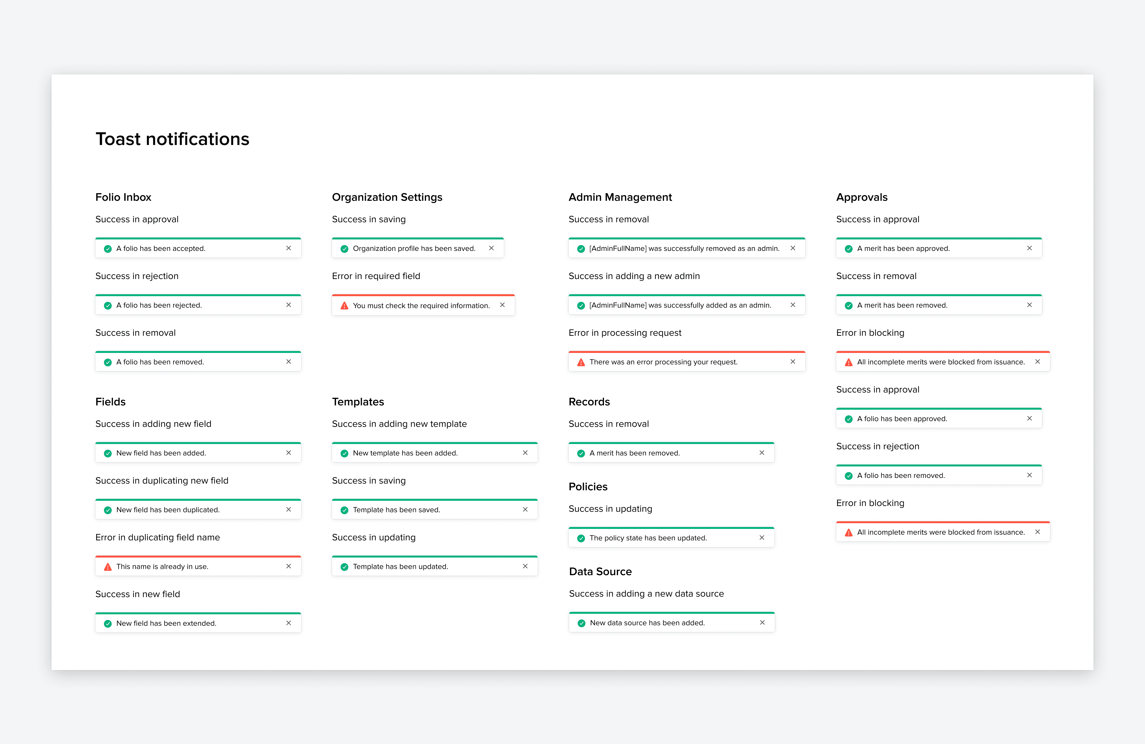
I am continuously developing the components and adding details such as spacing, layout, and different usages. Worked with Product Marketer on Tone of voice (Empty states, notification, alarms, entry experiences, error, success message, title, subtitle, description, modal, etc.)
GUIDELINE
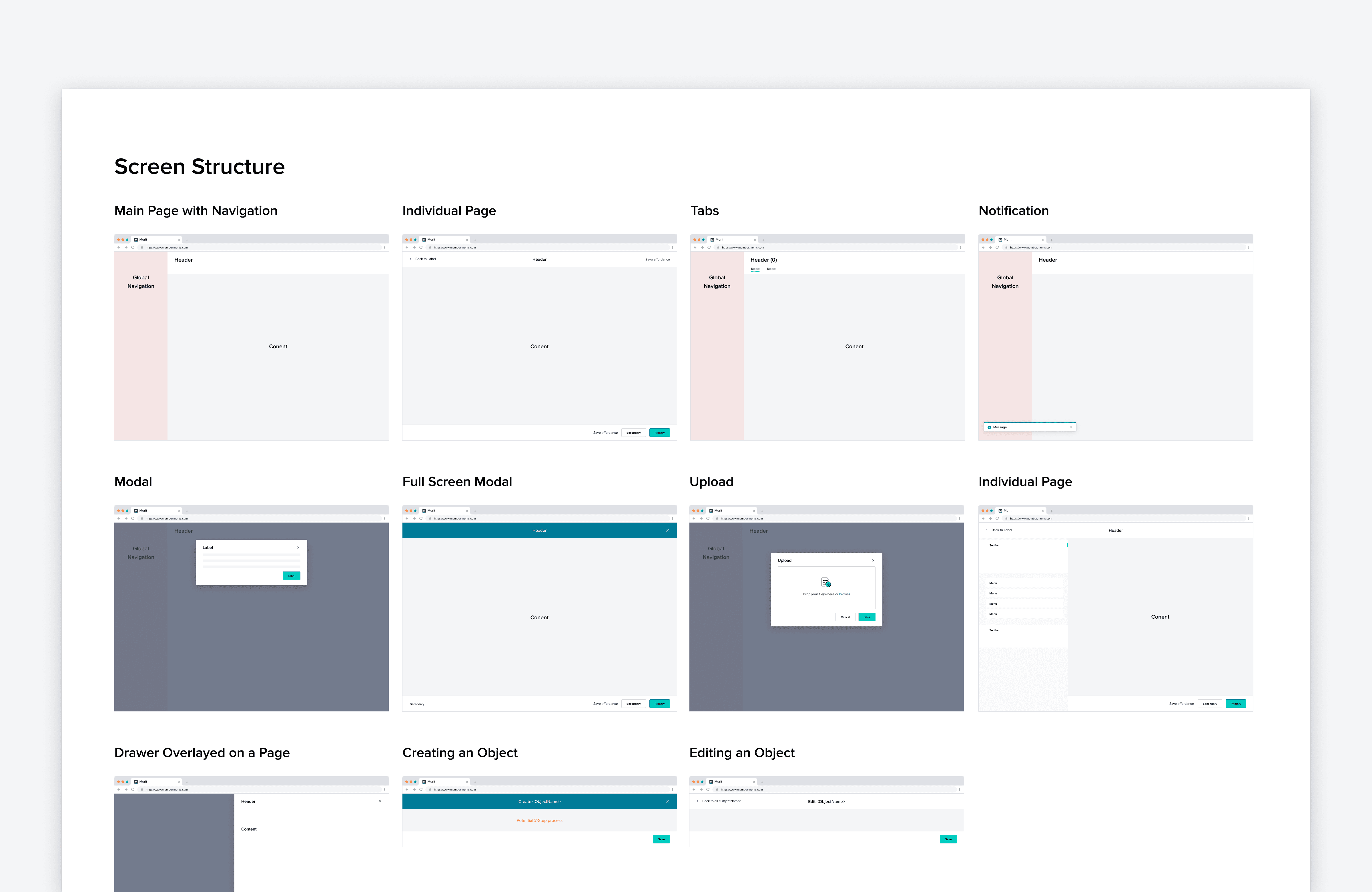
I created new guidelines on how to use the UI and maintain UX patterns in our products. These include structures, empty states, artworks, and the difference between global success or error notifications and modal notifications. These guidelines will help with component development and communication with the Engineering team.
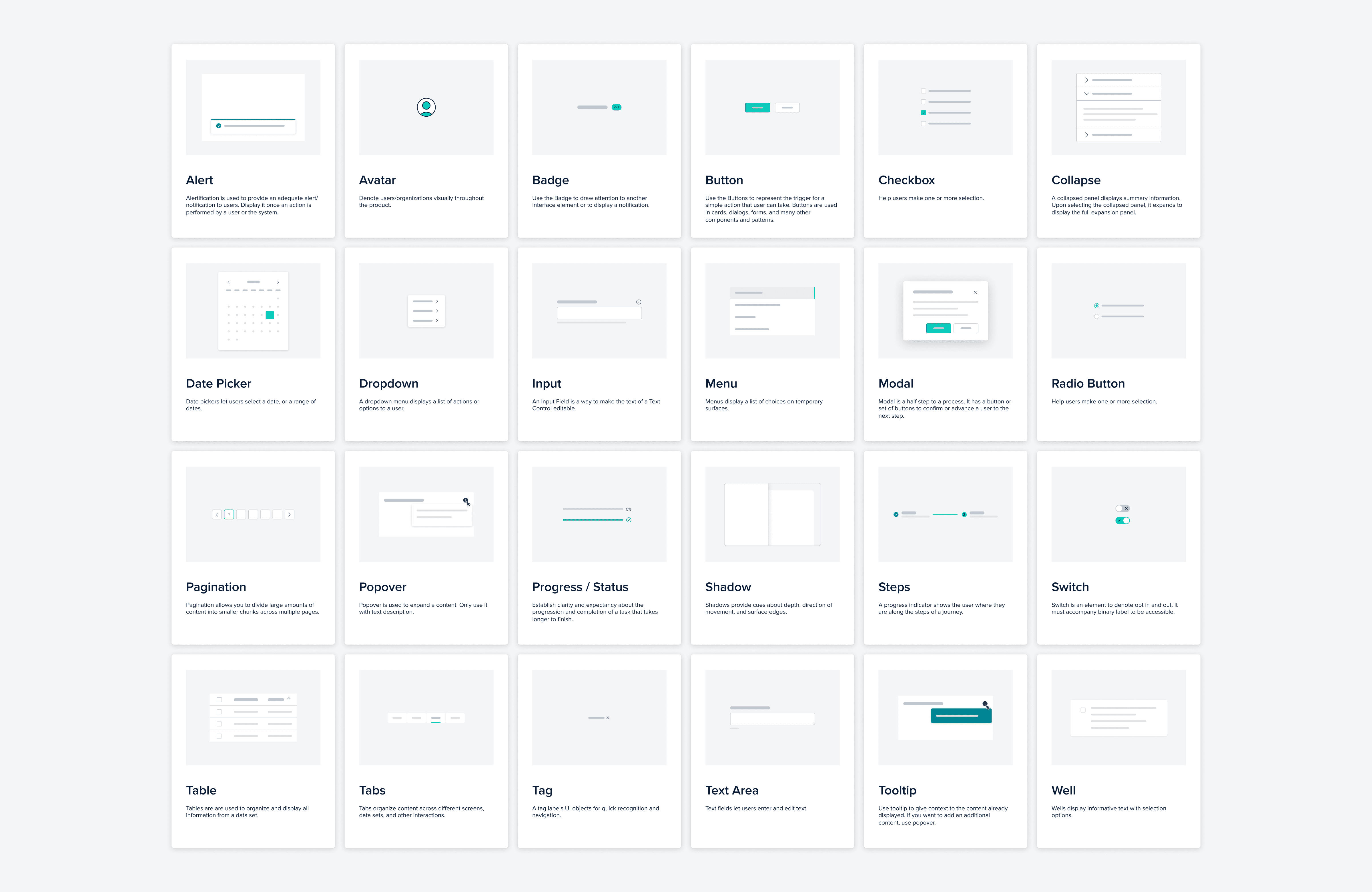
FINAL DESIGN
OUTCOME
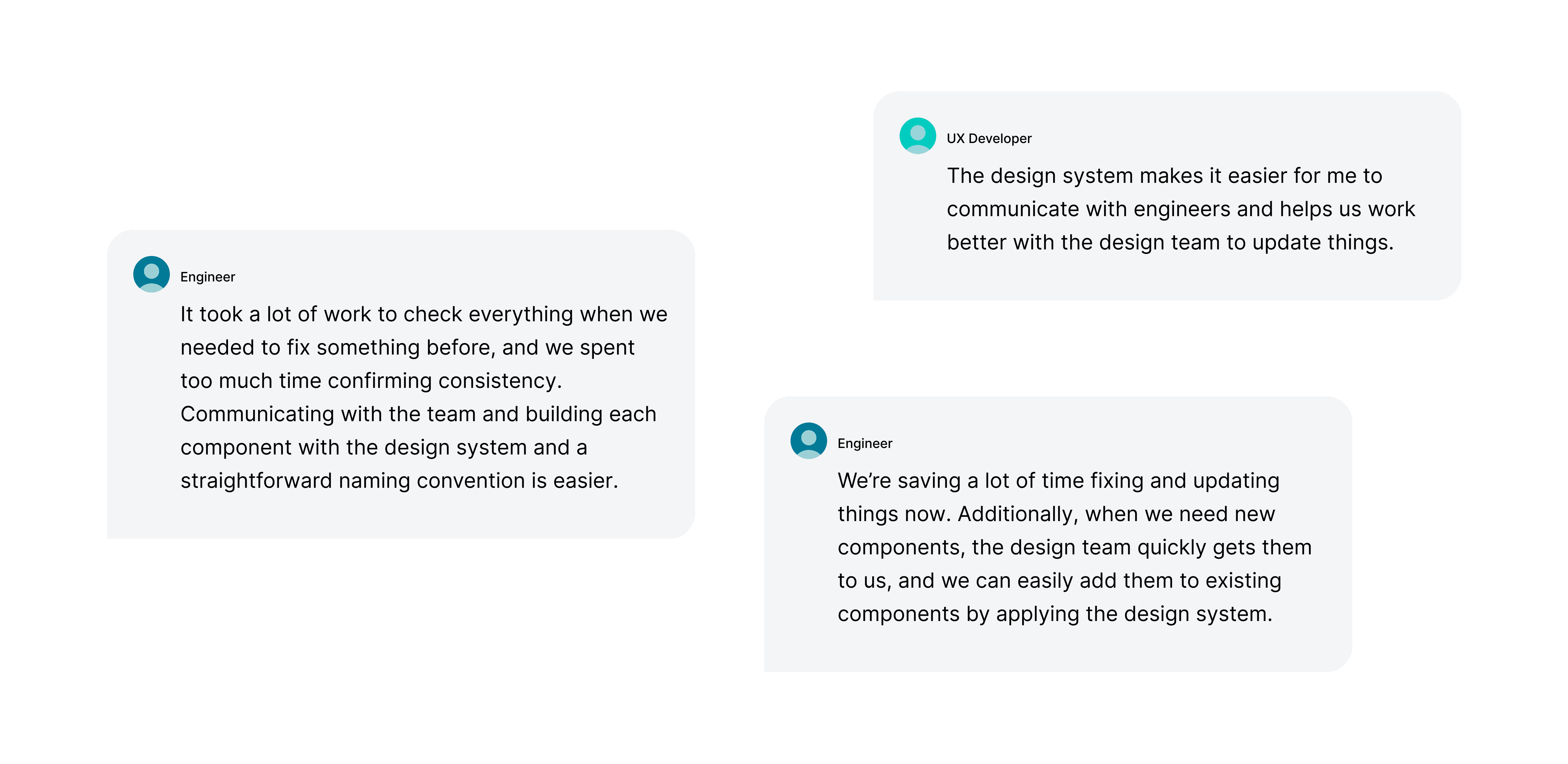
Establishing components reduced the time needed to implement design changes by 40%.
Our design system is built on the foundation of having components as a source of truth. This means that we can easily update assets and production code without having to go through the hassle of updating each individual element.
The new design system increased design consistency across products, enhancing user satisfaction and brand recognition.
The new design system not only saves us time but also ensures that our products are always up-to-date and consistent across all platforms.
FEEDBACK
KEY TAKEAWAY
Takeaway 1
Through this project, I learned that maintaining consistency in accessibility across all products is essential but difficult. I also discovered that the design system is an ongoing project, as we have more specific guidelines and patterns to maintain consistency across all products.
Takeaway 2
I learned how to consider various use cases, how to transform this knowledge to expand the components library, and how to organize all the layers with naming convention, build auto layout, and manage individual components.
Takeaway 3
If I have another opportunity to work on the design system project, I will conduct sufficient research before starting to build the components. Additionally, I will map out the elements I need to build first to have a bird's-eye view, so that I can save more time when updating the elements.
© 2026 Jungmin Lee.
